Marko Oja
Marko helps customers to understand the endless possibilities of technology and to transform innovative ideas into technical solutions. Agile methods and process development are close to his heart.
Let's start right from the beginning with a disclaimer: Artificial intelligence still doesn't know how to figure out data quality deficiencies. It can't even search for them very well on its own. You need to show it some love for it to manage. But you can easily get quite many benefits for the task at hand from machine learning as it is today.
Data profiling is one of my all-time favorite data development tools. A few years ago, I got to know the Pandas Profiling Python library, which does so much of the work that I previously had to do manually, mainly using SQL and Python. Data profiling can catch a wide variety of problems, but if the cause-and-effect relationship is not simple, it is not useful for a deeper investigation. The cause of the problem often has to be dug up more or less manually after profiling. So, I set out to investigate whether ML and the technologies used for its development, could somehow help me in finding the causes of quality problems.
ML visualizations to help find the culprit
The first way to dig a bit deeper in the investigation of the data set quality is to make use of different graphical representations of information. These visualizations are more commonly used in the development of machine learning models, in the data set preparation phase. The data of a single attribute can be evaluated based on dot, box, and scatter patterns, among other ones. These graphs provide more depth to data profiling, especially when trying to identify things from the data that are not quite clear. Like what is generally done in ML development. 😊
How then could these same methods be harnessed to find the causes of an error found in the profile results? The first step, like in ML development, is to transform and prepare the data so that it can be plotted on a graph. Dates can be converted to integers, and numeric values can be created for categorical data in text format. In order to visualize a specific error, the incorrect lines should be marked. So, for example, the value 1 for the line where the error occurs and the value 0 if the line is OK.
A good practice is to check for only one type of error at a time. Otherwise, the cause-and-effect relationships can be challenging to find, as there may be more than one possible reason for the errors.
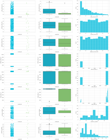 When the material has been properly prepared, a graphic presentation can easily be run from it. Naturally, the column where the problem occurs is left out of the analyzed data and is replaced by the previously created error flag. The graphs can then be run, column by column, with the error flag set on the x-axis and the compared attribute on the y-column. Here is an example of the result of strip, box, and histplots from the seaborn-library, with a few columns.
Just from this, very quickly built visualization, you could find strong cause-and-effect relationships at a glance. However, there were so few incorrect rows in my example dataset that it is difficult to find the reasons. However, some correlations were noticeable and in many real data sets, they can often be found easily. For example, the values produced by faulty devices could appear in the first graph type, grouped for certain categories. Or similarly at a certain time of the day formed errors might be visible in the middle one, targeting a certain area in the distribution.
About the used data
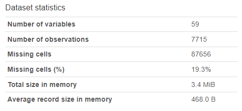 The previous pattern was run on a dataset that I have used to test various technologies for monitoring data quality. However, it was too narrow for the next steps, so I changed to the farmers markets dataset found in the Databricks samples. The example data consisted of 59 columns with a significant number of empty values. The size of the data set is 7715 rows. The updateTime-column of the dataset contains a date format that does not translate directly to a timestamp. I marked the lines containing such values as incorrect, to reflect my qualitative deviation of the data.
Hidden features of AutoML
The basic visualizations used in Data Science already provide a lot of additional information about the data set being processed, but this can be taken a step deeper. And above all, it can be done with reasonably little effort. Databricks introduced the AutoML functionality a few years ago. AutoML, as the name suggests, automates ML development. It preprocesses values, selects variables, and tests different models to solve the set problem. AutoML may not quite be able to perform at the level of good AI developers, but it does perform significantly better than such an AI beginner as me. At least when the same amount of time is available, i.e. 15 minutes, for example.
But how can the results of AutoML be useful when solving the quality problem in the data set? The forecast model itself is not useful in this case, because we already know how to identify incorrect data. However, it is possible to conclude one thing or another from the final results related to the construction of the model.
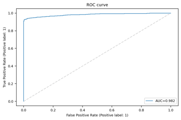
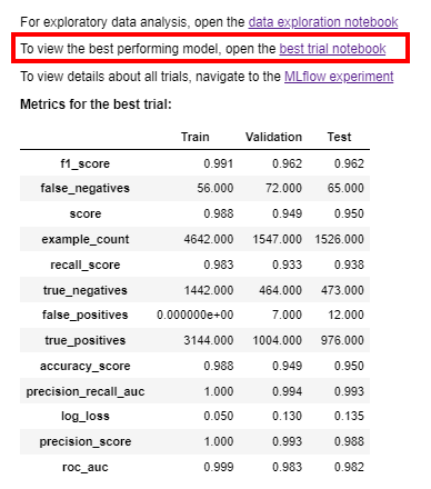 The metrics of the model, the ROC curve, and the confusion matrix, all tell at a high level how the model produced by AutoML was able to find relationships in the data. All three results tell more or less the same thing in different forms: how well the model worked. The lowest values of roc_auc and precision_score can be found in the model's basic metrics. These tell how accurately the model performed. If the value of the ROC curve is closer to 0.5 than 1, then the results should not be looked at beyond this. However, if the values in the table suggest that a workable prediction has been found, then it is worth opening the best_trial_notebook link.
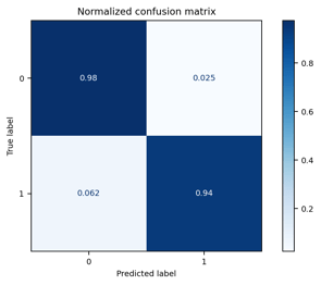
Behind the link, you can find, without editing, the ROC curve and the confusion matrix. In practice, these graphs present the results of the previous table in graphic form. In my model example (Databricks: samples data.gov/farmers_markets_geographic_data) I tried to find "reasons" why the updatedTime column had incorrect values. There are probably no real reasons to be found in this data, but the results showed that the missing values were strongly correlated with the values of other fields. The ROC AUC value with the best model was 0.982, which indicates a very strong correlation.
AutoML and SHAP-values
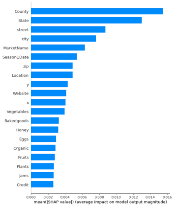
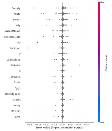 Although the previous graphs are nice to look at, they do not offer any new information compared to the table. However, there is a setting in the notebook that can be changed to unearth much more interesting information. Under Feature importance, there is a variable shap_enabled, which defaults to false. If you change this value to true and run the workbook again, a new graph of SHAP values will also be printed. SHAP values describe the significance of each attribute for the results of the ML model. So, very roughly expressed, the higher the value, the more relevant it is for determining the final result.
It should also be mentioned that the example data initially had a total of 59 variables. At this point, the model has eliminated about 2/3 of these.
 Manual validation of the results of the SHAP calculation quickly confirmed the situation: Just by combining the values of the County and Vegetables fields, a combination was found where with 100% certainty to identify almost 60% of the rows where no error is found. I suspect, that the Y/N type attribute of vegetables, is marked as N for rows where the value was not present. In addition to this, if the County value was left blank, the probability of an incorrect UpdatedTime value increased significantly. I assume that the material has been compiled from multiple different materials, of which the old one(s) have more systematically incomplete information. At this point, I can't confirm my assumption any further, but now I would at least have a concrete question with which I could approach the producer of the information.
Fast results and missed opportunities
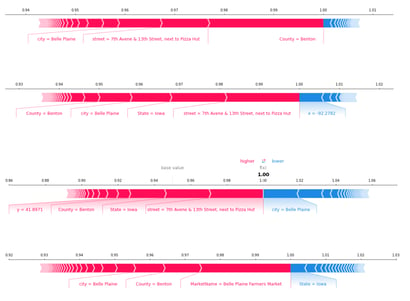 Both the data preparation and ML model development parts could have been taken MUCH further than the way I have described here. It was a bit disappointing that the dataset did not include numerical values that would have been more interesting in the SHAP graphs. I was able to compress a few more graphs with a little additional adjustment (like the row-specific analysis shown here). However, you should be careful with over-implementation, especially when it's only about data profiling. The goal is to evaluate the quality and suitability of the data set for the desired purpose of use, i.e. in this case data loading, transformations, and modeling. Profiling usually does not require as deep and comprehensive a result as the preparatory analysis of data needed for training a machine learning model.
If such analyses arise in the works of a Data Engineer or a similar role, it is worth sharing them with others. Both business, analysts and ML developers may benefit from them. Personally, I would like to see profiling carried out for each integrated data set, and above all the results of the developer's own analysis be presented. As a method of operation, in my opinion, this would increase the quality of many implementations considerably, by eliminating unnecessary investigation work. In a suitable scope and by utilizing automation, data profiling makes it possible to reduce the total workload of data development. And by using ML techniques, even this work phase can be deepened and accelerated even further.